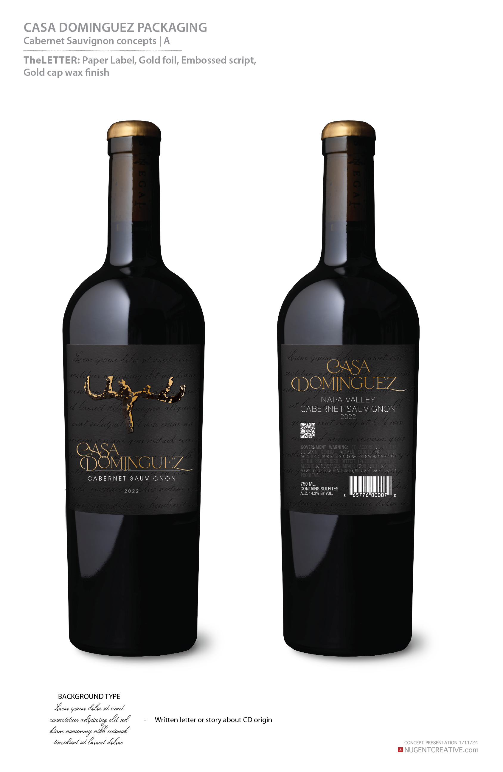
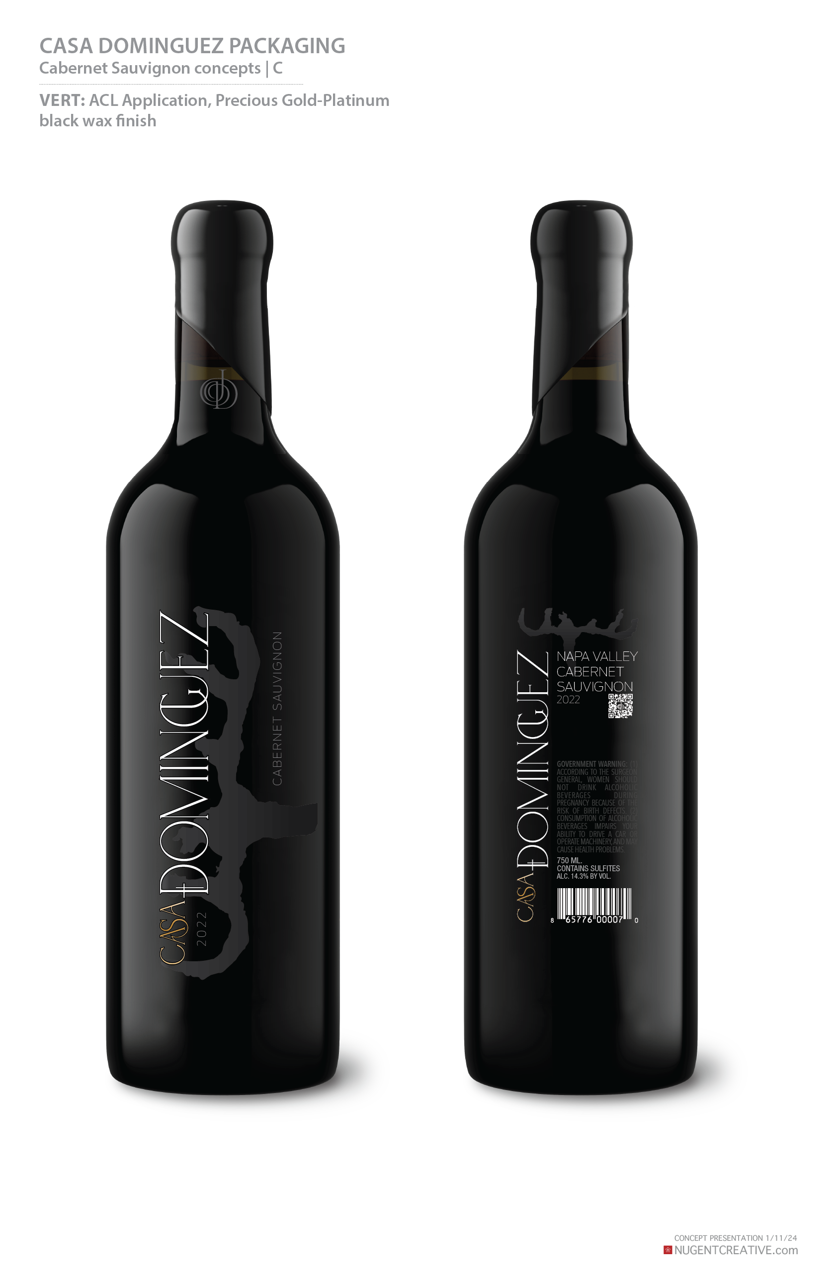
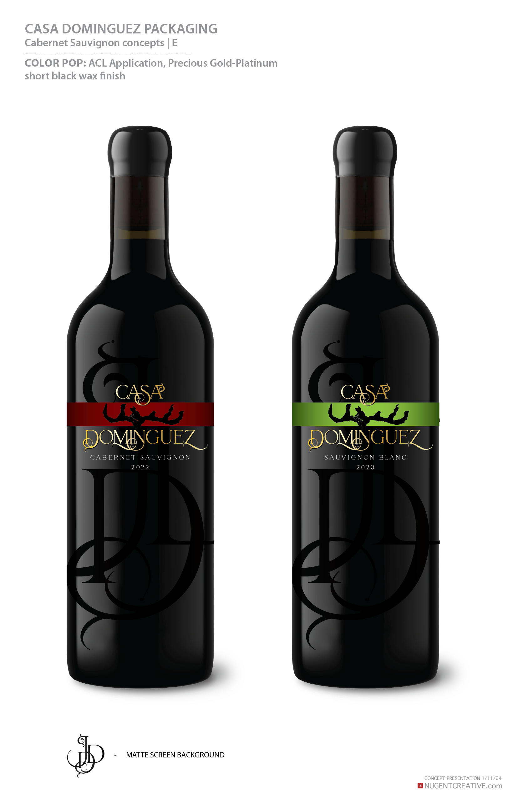
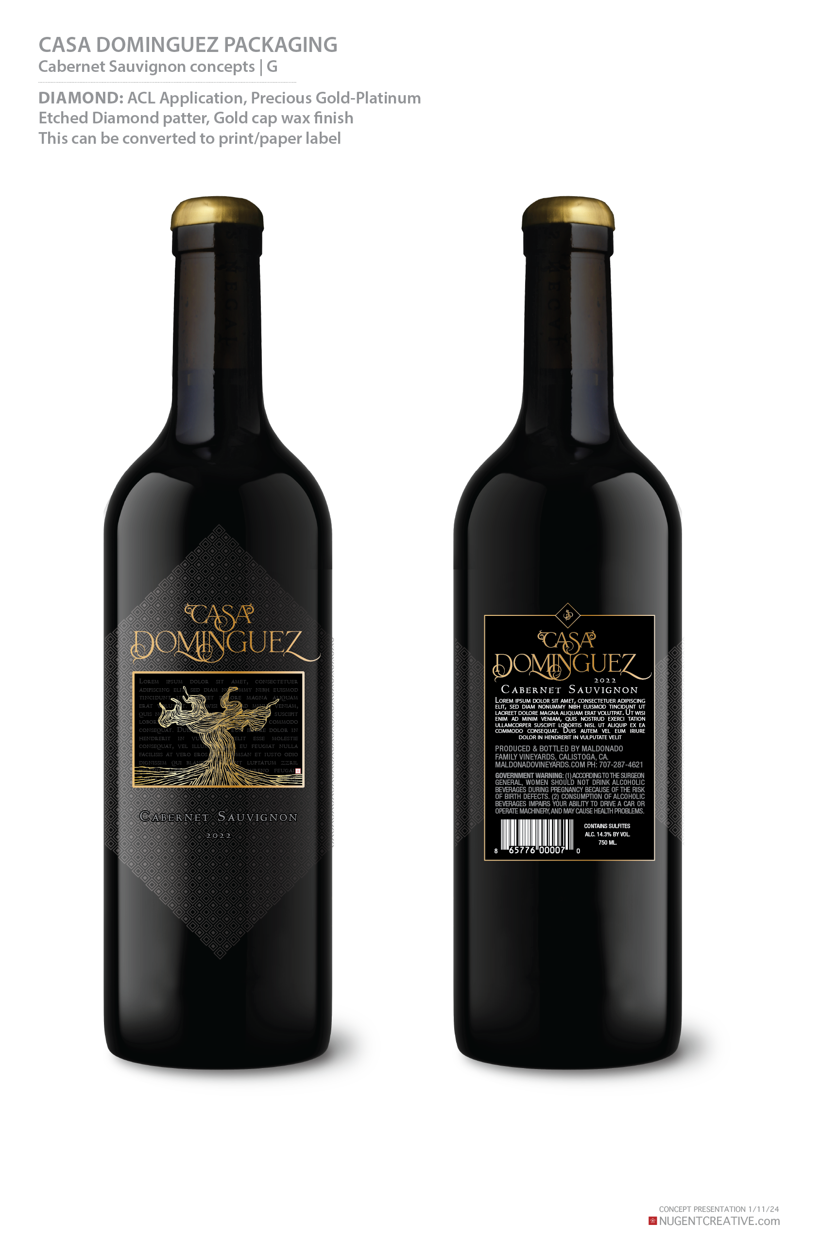
CASA DOMINGUEZ this packaging is a testament to a true love story, family, and what wine is about. It was my pleasure to give my time to this project for a long-time client when I heard its story. We started with a name for the brand, an image of the original grapevine planted, then a reason to create packaging, and not much else. As a primary Concept Artist, 90% of the work never sees the light of day, but is the most exciting part as we start to bring the brand to life. Below are the original concepts based on exploring the name “Casa Dominguez”.
The Benessere Package redesign was an open request to bring creative for a new modern feel for the brand. From cage, foil, to neck band and ACL, once I knew I would be playing with clear glass, the product became the backdrop. I wanted to use the B as the center piece, wrapping it around the bottle to show through giving it a whimsical movement. Choosing precious metals and ACL were combined to compliment and accent the product palette.
Create a brand identity and packaging for the word JUXTAPOZ for Delicato Family Vineyards. In trying to get a consumer to visually understand what the meaning of Juxtapoz is, the idea of old V’s new harmonizing in the process of this bold red wine. I found an illustration of an amazing tattooed elegant modern woman and the conversation was born as to what the equivalent rebel from the early days of wine making would look like. Found the original artist a Barcelona native, Gabriel Moreno and had him recreate the art in the Marie Antoinette style to overlay in a pinwheel style. The end result was selected as the #3 “The Coolest Wine Labels” from Forbes Magazine - 2015. The biggest challenge on this project was communicating the needs and adjustments for the artwork beings the illustrator was half way around the world and did not speak any English so our translator had to play subjective middleman.
The Dave Matthews Dreaming Tree, Cabernet Sauvignon Reserve project was fun from the "Famous musician" aspect. I’m not a Dave Mathews vibe so some research was needed but In this phase I discovered he has 3 children and the idea of adding in 3 graphic elements to the concepts was a nice nod to represent the his accomplishments. Each concept had 3 little gems which we highlighted in foil, this final version took on 3 doves hiding in the tree in the precious gold. Copper metallic background, precious gold type with the pop of red to bring it all together.
Ravenswood Congresso packaging for Constellation Brands. The name Congresso means: a formal meeting, especially an assembly, so how does it play in to Ravenswood brand theme? I played with quite a few flocks of Ravens (not a Murder, those are Crows) this final concept provided the movement and texture for the new line.
Noble Vines label redesign for the Delicato Family
The challenge with the redesign was to take the previous version which just has a red number and carry that into a more comprehensive wine label that consumers could grab onto while retaining the story of the numbers. The previous version did not communicate the significance of the number to consumers or the reason it was so prominant on the label. By lowering it and bringing the story front and center gave it the presence it deserved and needed.
Vendange package redesign for Constellations Brands
Ooh La La new Brand for the Innovations department to launch new “lightly fizzy wine” product to market. This was a fun French feel inspired identity. There were a few ideas that didn’t make it to the final packaging production, custom elegant bottle mold and a sexy closure/cage were proposed by didn’t make the cut. Constellations Brands
Blackstone package redesign for Constellations Brands


